What is GUI?
GUI (Graphical User Interface) is a visual way for users to interact with software applications through graphical elements like windows, icons, buttons, menus, and other visual indicators, rather than using text-based command-line interfaces.
Features of GUI
User-Friendly: Makes applications accessible to non-technical users
Visual Feedback: Immediate visual response to user actions
Data Visualization: Better for displaying charts, graphs, and images
Cross-Platform: Can create applications that work on Windows, macOS, Linux
Professional Appearance: Creates polished, professional applications
Python GUI libraries
- Tkinter (Standard Library)
- PyQt/PySide
- Kivy (for Multi-touch Applications)
- wxPython
GUI development in Python allows you to create powerful, cross-platform applications that can serve both technical and non-technical users effectively. The choice of library depends on your specific needs, project requirements, and target platforms.
List of tkinter widgets
| Widget | Description | Widget | Description |
|---|---|---|---|
| Basic Widgets | |||
| Label | Displays text or images | Button | Clickable button that triggers commands |
| Entry | Single-line text input field | Text | Multi-line text widget with rich text capabilities |
| Frame | Container widget for grouping other widgets | Checkbutton | Checkbox for boolean values |
| Radiobutton | Radio buttons for exclusive selection | Scale | Slider widget for selecting numeric values |
| Listbox | Displays list of items for selection | Scrollbar | Adds scrolling capability to other widgets |
| Canvas | Widget for drawing graphics and custom widgets | Menu | Creates menu bars and context menus |
| Menubutton | Button that displays a menu when clicked | Message | Multi-line text display (like Label but with automatic wrapping) |
| Spinbox | Numeric entry with increment/decrement buttons | ||
| Top Level Windows | |||
| Tk | Main application window | Toplevel | Secondary window |
| Special Purpose Widgets | |||
| LabelFrame | Frame with a labeled border | PanedWindow | Container with resizable panes |
| OptionMenu | Dropdown menu for selecting options | ||
| Themed Tkinter Widgets (ttk module) | |||
| ttk.Button | Themed button widget | ttk.Checkbutton | Themed checkbox |
| ttk.Combobox | Dropdown menu with optional text entry | ttk.Entry | Themed entry widget |
| ttk.Frame | Themed frame container | ttk.Label | Themed label widget |
| ttk.LabelFrame | Themed labeled frame | ttk.Menubutton | Themed menu button |
| ttk.Notebook | Tabbed interface container | ttk.PanedWindow | Themed paned window |
| ttk.Progressbar | Progress indicator | ttk.Radiobutton | Themed radio button |
| ttk.Scale | Themed scale/slider widget | ttk.Scrollbar | Themed scrollbar |
| ttk.Separator | Visual separator line | ttk.Sizegrip | Resize handle for windows |
| ttk.Treeview | Table/tree structure for hierarchical data | ttk.Spinbox | Themed spinbox widget |
| Dialog Boxes (tkinter submodules) Message Boxes (tkinter.messagebox) | |||
| showinfo() | Information dialog | showwarning() | Warning dialog |
| showerror() | Error dialog | askquestion() | Question dialog |
| askokcancel() | OK/Cancel dialog | askyesno() | Yes/No dialog |
| askyesnocancel() | Yes/No/Cancel dialog | askretrycancel() | Retry/Cancel dialog |
| File Dialogs (tkinter.filedialog) | |||
| askopenfilename() | Open file dialog | asksaveasfilename() | Save file dialog |
| askopenfilenames() | Open multiple files dialog | askopenfile() | Open file dialog returning file object |
| asksaveasfile() | Save file dialog returning file object | askdirectory() | Directory selection dialog |
| askcolor() | Color selection dialog | Font | Font specification and measurement |
| Variable Classes | |||
| StringVar() | String variable for widget linking | IntVar() | Integer variable for widget linking |
| DoubleVar() | Float variable for widget linking | BooleanVar() | Boolean variable for widget linking |
| Image Handling | |||
| PhotoImage | For displaying images (GIF, PGM, PPM) | BitmapImage | For displaying bitmap images |
| Canvas Items (not widgets but drawable objects) | |||
| Line | Line on canvas | Rectangle | Rectangle on canvas |
| Oval | Oval/Circle on canvas | Polygon | Polygon on canvas |
| Arc | Arc on canvas | Image | Image on canvas |
| Text | Text on canvas | Window | Embedded widget on canvas |
Label Widget
A Label is a Tkinter widget used to display text or images that users can read but cannot edit.
import tkinter as tk
root = tk.Tk()
label = tk.Label(root, text="Hello World")
label.pack()
root.mainloop()
Tkinter Layout Managers
In Tkinter, layout managers are used to arrange widgets inside the window. There are three main geometry managers:
pack() grid() place()
pack() method:
Thepack()method organizes widgets in blocks (top, bottom, left, right). Widgets are placed relative to each other.
Syntax: widget.pack(options)
Key Options:
side="top"(default) /"bottom"/"left"/"right"fill="none"(default) /"x"/"y"/"both"expand=True/False- Expand to fill extra spacepadx=5,pady=5- External paddinganchor="n"/"s"/"e"/"w"/"center"(compass directions)
Button Widget
A Button is a Tkinter widget that creates a clickable button to trigger actions or commands when pressed. It’s one of the most fundamental interactive elements in GUI applications.
Example:
import tkinter as tk
def click_me():
print(“Button was clicked!”)
root = tk.Tk()
root.title(‘ButtonDemo’)
root.minsize(400,200)
# Basic button
button = tk.Button(root, text=”Click Me”, command=click_me)
button.pack()
root.mainloop()
If you run the code…
Window appears with a button labeled "Click Me"
When you click the button: Thebutton_click()function executes
Console displays: "Button was clicked!" each time you click
Window stays open until you close it (click X button)
Button widget options
| Option | Description | Default Value | Example Values |
|---|---|---|---|
text |
Text displayed on the button | "" |
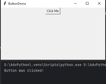
"Click Me", "Submit" |
textvariable |
Variable to control button text dynamically | None |
tk.StringVar() |
command |
Function to call when button is clicked | None |
my_function |
state |
Button state | "normal" |
"normal", "disabled", "active" |
width |
Button width in characters | 0 (auto) |
10, 20 |
height |
Button height in lines | 0 (auto) |
2, 5 |
font |
Text font | System default | ("Arial", 12), ("Helvetica", 14, "bold") |
fg |
Text color (foreground) | System default | "red", "#FF0000", "white" |
bg |
Background color | System default | "blue", "#0000FF", "lightgray" |
activeforeground |
Text color when mouse is over | System default | "yellow", "#FFFF00" |
activebackground |
Background color when mouse is over | System default | "darkblue", "#000080" |
disabledforeground |
Text color when button is disabled | System default | "gray", "#808080" |
borderwidth |
Width of button border | 2 |
0, 5, 10 |
relief |
Border style | "raised" |
"flat", "raised", "sunken", "groove", "ridge" |
padx |
Horizontal padding inside button | 1 |
5, 10, 20 |
pady |
Vertical padding inside button | 1 |
5, 10, 20 |
image |
Image to display on button | None |
tk.PhotoImage(file="icon.png") |
compound |
Image position relative to text | "none" |
"left", "right", "top", "bottom", "center" |
cursor |
Mouse cursor when hovering | "" |
"hand2", "arrow", "watch", "cross" |
anchor |
Text positioning within button | "center" |
"n", "s", "e", "w", "ne", "nw", "se", "sw", "center" |
justify |
Text alignment when multiple lines | "center" |
"left", "center", "right" |
wraplength |
Wrap text at this width | 0 (no wrap) |
100, 200 |
underline |
Index of character to underline | -1 (none) |
0 (first char), 5 |
overrelief |
Relief when mouse is over | Same as relief | "raised", "sunken" |
takefocus |
Whether button can get focus | 1 (True) |
0 (False), 1 (True) |
highlightthickness |
Focus highlight thickness | 2 |
0, 5 |
highlightcolor |
Focus highlight color | System default | "yellow", "#FFFF00" |
highlightbackground |
Focus highlight color when not focused | System default | "gray", "#808080" |
Common Methods for Button Widget
| Method | Description | Example |
|---|---|---|
config() | Configure button options | button.config(text="New Text") |
cget() | Get option value | text = button.cget("text") |
invoke() | Programmatically click button | button.invoke() |
flash() | Flash the button visually | button.flash() |
bind() | Bind event to button | button.bind("<Enter>", on_hover) |
focus_set() | Set focus to button | button.focus_set() |
state() | Get or set button state | button.state(["disabled"]) |
Item #2
Item #3
Text Widget
What is Text Widget?
The Text widget is a powerful multi-line text editor that supports:
Rich text formatting
Text styling and colors
Embedded images and widgets
Text searching and manipulation
Undo/redo capabilities
Example 1
import tkinter as tk
root = tk.Tk()
root.title(‘Text Widget Demo’)
root.minsize(300, 200)
# Create a text widget
text1= tk.Text(root, width=50, height=20)
text1.pack()
root.mainloop()
Example 2
import tkinter as tk
root = tk.Tk()
root.title('Text Widget Demo')
text_widget = tk.Text(
root,
width=80, # Characters wide
height=25, # Lines high
wrap="word", # Wrap options: "none", "char", "word"
spacing1=5, # Space above each line
spacing2=2, # Space between wrapped lines
spacing3=5 # Space below each line
)
text_widget.pack()
root.mainloop()
Example 3
import tkinter as tk
root = tk.Tk()
root.title('Text Widget Demo')
text_widget = tk.Text(
root,
font=("Arial", 14),
fg="blue",
bg="lightyellow",
selectbackground="lightblue", # Selection background
selectforeground="black", # Selection text color
insertbackground="red", # Cursor color
borderwidth=2,
relief="sunken"
)
text_widget.pack()
root.mainloop()
Example 4
import tkinter as tk
root = tk.Tk()
root.title('Text Widget Demo')
text_widget = tk.Text(
root,
state="normal", # "normal" or "disabled"
undo=True, # Enable undo functionality
maxundo=-1, # Unlimited undo steps
autoseparators=True, # Auto separators for undo
tabs=("1cm", "2cm") # Tab stops
)
text_widget.pack()
root.mainloop()
Example 5 Text Manipulation Methods
import tkinter as tk
root = tk.Tk()
root.title('Text Widget Demo')
# Basic insertion
text_widget.insert("1.0", "Hello World!") # Line 1, character 0
# Insert at specific positions
text_widget.insert("2.5", "inserted text") # Line 2, character 5
text_widget.insert("end", "\nAppended text") # End of text
# Insert with tags
text_widget.insert("1.0", "Important!", "important")
text_widget.pack()
root.mainloop()
Example 6 (
Frame Container Widget
What is a Frame Widget?
Item #2
Item #3
Checkbutton
Radiobutton
Listbox
Scale
Scrollbar
Canvas
Menu
Menubutton
Message
What is messagebox?
The messagebox module in Tkinter provides a set of dialog boxes for displaying messages or asking simple questions to the user. These are modal dialogs that pause the program execution until the user responds.
What are the features?
Modal dialogs (block program execution until closed)
Pre-built templates for common scenarios
Cross-platform compatibility
Easy to implement
How to import?
There are two common ways to import messagebox.
# Method 1: Import the entire module
import tkinter as tk
from tkinter import messagebox
# Method 2: Import specific functions
from tkinter import messagebox as mb
showinfo()
showwarning()
showerror()
askquestion()
askokcancel()
askyesno()
askretrycancel()
askyesnocancel()
Return Values and Handling Responses
| Function | Return Values | Data Type |
|---|---|---|
showinfo(), showwarning(), showerror() |
“ok” | str |
askquestion() |
“yes”, “no” | str |
askokcancel() |
True, False | bool |
askyesno() |
True, False | bool |
askretrycancel() |
True, False | bool |
askyesnocancel() |
True, False, None | bool/None |
